Portraiture
 |
| Sr. David Attenborough circa 2007 |
Definition & Theory
Portraiture, in photography, is a photograph of a figure which primarily captures the emotion and detail of the face, as if it's interacting with you. They're usually commissioned by schools, celebrities, weddings and businesses.
It's a painting, photograph, sculpture or other artistic representation of a person, in which the face and its expression is predominant. The intent is to display the likeness, personality and even the mood of the person. Personally, I believe it to be about capturing pure emotions of an individual, the reality of a situation through the figure's face. Think about it, when a news photographer takes a photo of an unlucky individual from a war-torn country, it shows the pure upset and terror which has been caused. Portraiture sparks conversation. It changes opinions, ideologies. It gives reason to sympathise or empathise. It's the most authentic way of showing the feeling of a person.
The photo linked to the right of me shows David Attenborough, one of the most famous people to come from the UK. He has a rather solemn look, as if he's tired. At first glance though, he may seem like he's smiling. The more you look at the photo, you see how it's more as if he is concentrating or in deep thought. He's emotionally tired, not physically. He's also looking down which could connote to negativity, as if he's disappointed in something. What it is, we don't know.
 |
| Winston Churchill circa 1940s |
Here is another photo, specifically of Winston Churchill from mid-war era. He is seen standing seriously, with one hand on his hip and his face slightly dipped. It's as if he's looking down on his enemies. The photographer used high exposure to capture a more significant emotion, as if to give strength to Churchill and therefore the nation.
 |
| Amanda Lepore circa 2000s onward |
Finally, this photo of Amanda Lepore is very different to the former two photos. It shows Lepore looking away from the photo, with a pose which exposes her left shoulder. This could connote to quite a glamorous look, which is confirmed by the use of significant makeup. Her eyes looking down could also connote to her putting her guard down, as if she is friendly to the viewer. Furthermore, it could be empowering women and more so trans-women, as she successfully transitioned from MTF.
two lighting styles
midkey
lowkey
Annie Leibovitz
This artist is infamous in the photography community for her photos. She has taken pictures of everyone. Jennifer Lawrence, Adele, Mark Zuckerburg, and even Queen Elizabeth II. She was born in 1949, and is aged 69 as of October 2nd this year. She always focused on more serious photos, capturing the true emotion in people, rather than a plain smile, a façade to hide inner emotion.
Contact Sheet
AO2 Photos
Best and Worst Images
12 Best
6 Worst
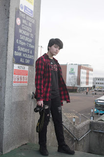
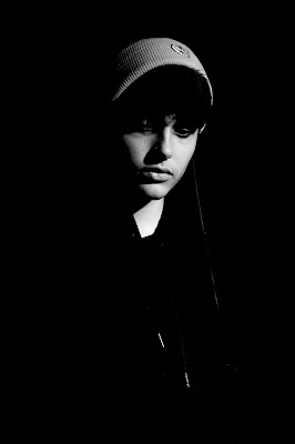
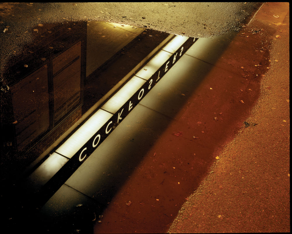
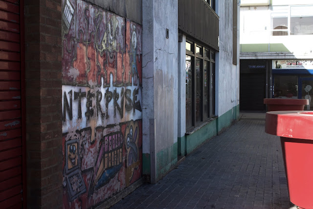
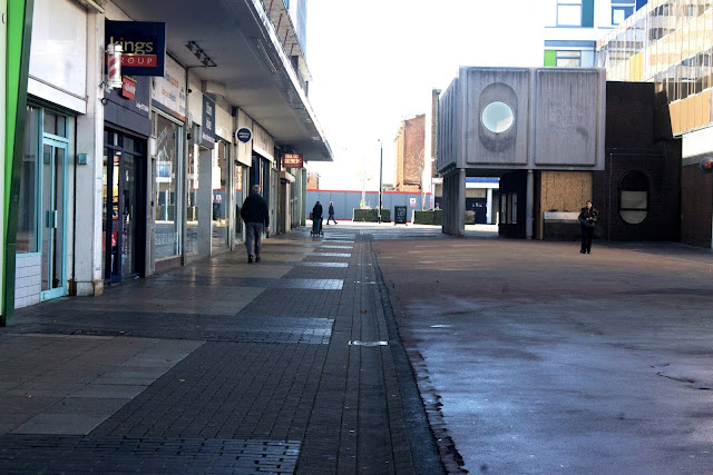
The photos shown were taken in the space of two to three days, using a few people via whoever was most convenient. The best photos all focused on a mix of urban culture, as well as portraying emotion, or the lack thereof. They were taken around the Harlow area, as well as using different tones to my advantage. The best photos, for example, have a variety of high and mid-contrast shots. The two dark-toned ones taken in the studio both were purposefully taken with a conical snoot on the main light. This concentrated the light onto the face, and made the exposure much more lacking in the areas which needed to be darker. It links a lot to the photo by Leibovitz where it focuses on negative space.
Edits
AO2
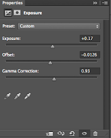
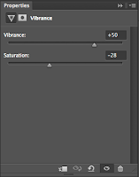
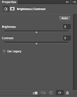 To edit my photos, I used the tonal range to get a grasp on what the photo should look like. For all photos, I began by using the brightness/contrast tool, as well as curves and exposure. While using them, I gradually adjusted the sliders/graph to match the intended meaning in the image. Furthermore, I decided to add a better feel to many photos by using the Spot Healing Brush tool, which can selectively edit, change or remove pieces I place the brush on. It's very good at removing dirt or other small discrepancies you might not want on a photo.
Final Pieces
Used around 3 people (too many camera-shy people)


