Tuesday, 9 October 2018

Form


Form
Definition & Theory

Form, in a literal sense, is about any three-dimensional shape which can be interpreted into a variety of circumstances. For example, in the first diagram below we see multiple 3D shapes which have shadows casted onto them giving the realistic dimensional effect. Depending on the situation, different forms may give different connotations to meanings. Which then links to the photo on the right. This photo was originally of a malformed bell pepper, however when looking at it from this particular angle, it links to what a clenched fist might look like. This brings out so many connotations for what the meaning behind it is. It could be showing willpower, strength, rebellion, which all use the clenched fist as a symbol. 

In reality, form itself is about how light bends around an object, and how the light is displaced by shadows which emphasises the different features said object has. It is about giving clarification, but also implicating mystery. It can mean quite so many things, as you could use literally anything. For example, taking a photo of a .359 revolver with the American flag on it will have a variety of links which could lead back to Republicanism, and America.


Image Bank AO1


AO1 Artist Research
Jason Collins Photography


Quite different compared to my normal research, Jason Collins is quite good for form as he focuses primarily on the form of vehicles and automobiles, capturing elements where there are varying shapes and tones. For example, the photo of the sports car with scissor doors has been captured in a way so the reflection can be seen, and so there are varying shadows within the photo. The fact also that the doors are open gives it a somewhat unnatural look compared to what we think a car might look like, as those and the bonnet are both raised which partially alter the shape of the car. In addition to the sports car, the black Lexus diagonal from it is a very scenic shot which places the main light source behind the subject. This makes the vehicle stand out significantly, giving a different gradient on the side and front of the car, compared to the window and roof of it. Furthermore, the background itself is a very nice area to take photos in. It seems with photographing vehicles, the area around it is just as important when capturing theme, as it is the car itself. The GTR in the top left shows this, as it is a very flashy car in a considerably run-down looking area. This car wouldn't usually be seen in this area, so maybe it connotes to the personality of the driver. The driver might be some grungy character who prefers the industrial look over the posh feeling.

AO1 Contact Sheet
All photos I have taken

---


5 Best Photos


2 Worst Photos


---

AO3 Edits
How I made my photos


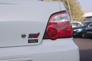
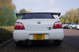
When I was improving the photos in post-production, I decided to use a burning and dodging-like technique where I erase some pieces of black and white so some areas retain colour. Beforehand, I decided it would be best to get the brightness, contrast and exposure to levels I feel would be necessary and best for the photo, and then I created a new Black/White layer. After creating I change the colour levels of the areas I won't be erasing. Finally, I used the fabled eraser and rubbed out the pieces I wanted gone. In this instance, I wanted to retain the colour in the logos and rear lights. After that's done, it makes it look quite punchy and three-dimensional. It also brings attention to points I want the reader to focus on. In this instance I was actually going to make the license plate colour as well for example, but instead I decided against it post-experimentation as it brought focus to the bottom of the car, rather than the middle-third.


Something I don't touch upon much is the history GUI. Whenever I edit my photos I always at some point end up having to undo multiple times. If I don't remember the keybinds on Mac to do that, the history tool is a very helpful tool which allows me to go back multiple times very quickly, back to an earlier state of the photo. It's also good at letting you see a before/after view of the photo.


Camera Settings

As per, I used my Canon EOS 1100D for taking photos. I used my main SD card, and for a small portion of photos I used my seperate macro lens to really focus on the small points of the photo. My shutter speed was around the ranges of 1/400 to 1/1000. My ISO remained around the consistent area of 400 to 1600, and my F-stop (aperture) was between F5.0 and F7.1. To conclude, the camera settings were consistent for the most part, and were all made for specifically daylight photos.

AO4 Final Piece
Final piece & Evaluation


contact sheet
best and worst photos
edits
camera settings
final piece and evaluation


Tuesday, 25 September 2018

Shape

Shape
Definition & Theory

A shape is an area enclosed by a line. It could be just an outline or it could be shaded in. 

They can be geometric, or irregular. When drawing them you must consider the size and position as well as the shape of the area around it. The shapes created in the spaces between shapes are referred to being negated, or negative space.

In photography, shapes play a significant role of focusing the eye on specific elements of the pictures. For example, for the second photo below, the eye directly shoots to the white shape in the middle, due to its central place in the photo, and bright characteristics. Another example could be how the first photo does similar to what the second had done. It also uses negative space to make said shape, which is an integral part of shape in photography.


Bill Brandt - Female Form

This is a photograph taken by Bill Brandt on female form, part of a series on the genre. He's used negative space to create an interesting composition which highlights only specific parts of the subject. Furthermore, the negative space is used to imply meaning by still leaving her chest in the shot. This could be considered an implied meaning which represents how women are objectified in society as sexual objects, while the arm raised and face shows they are frustrated with the issue. I believe this is not sexual objectification, but instead a representation of it. Regarding his methods, it's clear this has been edited to make the arm a completely white-washed shape, while having three different parts which have been negated.

Image Bank


Image result for shape photographyImage result for shape photographyRelated imageRelated image


Contact Sheet
AO1 - Images taken


5 Best Photos


2 Photos to be Improved


The images shown for improving aren't exactly up to scratch. For the first one, it's very clear that it has a lack of a specific focus to put your eyes on, other than the slight lines going down the picture. There is an extreme lack of depth, and it's not got much colour variance. For the second photo, while it has a very specific leading line going directly through the photo, it doesn't have a good angle. Furthermore, the right side of the photo is very rigid and it doesn't really make sense with a shape shoot.

AO3
Record ideas, observations and insights relevant to intentions, reflecting critically on work and progress.

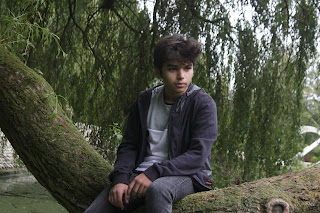
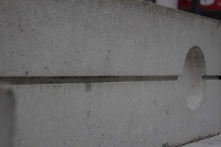
To get shapes similar to my artist research, I decided to go to a variety of places around town to get darker areas which can truly get negative space, like in the few photos I managed which were of a friend of mine under a big tree. In black and white and with some burning & dodging, I could make them into the photos I need. The photos were all taken in Harlow, mostly in and around the town centre. The images worked quite well, actually. Other than the few "bad apples", I managed to get some successful shots which linked back well. I used a few different days to get good shots with the right weather, for example the building shown in the five best images had great lighting, with a straight-edged shadow. 

The other images all were to be edited with higher contrast and b/w, to try and get the negative space effect without actually having the option to go into a studio (as of then). Linking to Bill Brandt, while it's not female form it definitely does get the human form into the picture, even if it's outside. That actually could give more character, because of the extra detail and stuff to focus on in the background.

Obviously it's not all perfect; a few of the photos didn't come out as they might've been able to. For example, the image of behind the person has very bad colours which come out grimey and a bit disgusting. The light-ish blue mixed with the dank green from the pond didn't exactly add up to a masterpiece. 

AO2
Explore and select appropriate resources, media, materials, techniques and processes, reviewing and refining ideas as work develops. 


As usual, I used my trusty Canon 1100D, this time with just the normal lens. They were taken in a variety of ISOs from 400-1600, and shutter speeds ranging from 100 all the way to in the thousands. For the aperture, it ended up around the f7.1 and f8. For the first pictures I used higher ISOs and a slightly increased shutter speed, and for aperture I had it set to around 6-7 because I wanted the main focus to be on the subject. For the rest of them I made sure to have the settings at standards which would link to what the scene looked like. However, for the first bad image this partly ended up bad due to its high ISO and shutter speed, and aperture which was at an F-Stop of 6.

In my later shoots I will use a tripod and the in-built flash to make sure the focus on the image is accurate and centred where I would like it to be.


In the two images with models, I decided to add saturation around the person only as well as putting in a multitude of light rays to emphasise the foreground and give more depth. For saturating him only, follow what I say in the final image, as it's a similar thing except for using the black/white adjustment. When it comes to the light rays however; I made a new layer and made the opacity of the brush around 35% to 60%. Then, I selected the right brush and pasted around 2 or 3 rays coming from the right of the image. This obviously would've interacted with the foreground negatively, so I rubbed out everything that touched the model to make realistic light which goes behind the individual. I left the rays to touch the tree however, as it is a cylindrical object which has more area to bounce light rather than the darker clothes which absorb more.


This one, as all of the rest did in some way, used burning and dodging to create a more intricate photo. I had first turned it black and white, and added a high contrast with exposure and gamma correction. Then, I noticed the diagonal shadow on the building was much lighter than the shadow on the left. To improve the picture, I decided to add another layer much darker than the first, inverted it (CMD+I Mac, CTRL+I Windows) and then took the white brush tool and painted over the shadow I wanted to darken. I also done this on the bottom of the roof, and the corner to give the extra depth and composition to the photo. If I were to further improve it, I would remove the tree in the corner as well as the cloud behind it, as it comes off as if it's a rogue paint behind said tree.


For the final image, I used burning and dodging once again, but at the most "severity" compared to the others. As visibly shown, I darkened the top of the bench as well as the front side of the support, and the edge of the bottom wooden bar. This  gave a great perspective of the photo as it shows the light coming from the top right of the picture, which is proven even more by the shadows created from burning and dodging the picture using the exposure tool and brightness tool. To show how to do this, I explained in the previous picture.


AO1
Develop ideas through sustained and focused investigations informed by contextual and other sources, demonstrating analytical and critical understanding.

I developed my work for shape from Bill Brandt, and how he uses negative space to really show how the image is presented. It assisted in finding geometry in shapes, like for the building, bench and tree. However, I wasn't able to truly capture the lack of space in the picture except for the bench, as all of it was pictured outside and in the day time, so to edit it exactly as intended would be a truly difficult task. Other than that, I managed to get interesting shapes, like the pictures of the subject sitting down below the canopy of a tree. Researching such things really helped me find what my intentions were to be for this shoot. 

In my opinion, I believe this element should be amended in the future to make sure that the real intention of the artist is represented through my work, rather than taking images that might link to the image bank.

AO4
Present a personal and meaningful response that realises intentions and, where appropriate, makes connections between visual and other elements.

The images shown could vaguely link to the artist, however they clearly fit in the realm of shape photography, as they capture the different curves and sharp corners which can be found in real life.