Colour and Emotion
Definition:-
Colour is a component of light which is separated when it is reflected off of an object.
Analogous
2 colours adjacent on the colour wheel
Complimentary
2 colours opposite on the colour wheel
Example
-Primary colours, Red Blue and Yellow, signify primal emotions like anger, sadness and enjoyment-Green implies calm, but can also reflect envy, as money in the USA is commonly green. Typically, if you see the right shade of green you might start envying having less money than another
-Purple, pink and calm warm colours signify intimacy, as well as a few hues of red
-Brown and black could imply negatives, like fear and disgust
-Orange gives a feeling of self-warmth
Starter


Both of these screenshots show different music videos (Tears Dry on Their Own and Yellow respectively.) and show different moods from the colours. The one on the left shows how she's feeling sickly or disgusted from the greenish-black hue, which could imply she's on a hangover. On the other hand, the one on the right shows a dark scene in which he's talking of early starts from a relationship, and he shows sadness.


As the two songs progress, they both become brighter and a little more vibrant. The former goes straight into a bustling city filled with commerce and community, with shades of yellow, green and a lot of blue. This could imply she is feeling envious of another, or that she is feeling excited and raring to go. The left has a significant increase in brightness as sunrise slowly comes, showing a journey out of the dark as he's met this significant other.
Theory & Image Bank
Analogous
The photo shows several chilli peppers which all have analogous colours, as each one is similar to the next. (Orange, Red-Orange, Red). The artist decided to place multiple peppers with analogous colours into the same box, which give you the feeling of warm colours (e.g. calm intimacy or excitement and/or power).
Complimentary
This is complimentary because of how there is a single red rose in a field of white roses. While not directly complimentary, red and white are almost opposite to each other, meaning that the red rose is complimented by the other white roses.
Muted
This muted set of buildings is such because of how it shows a mostly de-saturated photo, with a large majority of faded blues and yellows. The artist seems to have done this purposefully on a cloudy day to make the scene look even more washed out and bleak, giving the photo this clean and modern look you get from muted colours.
AO1 Artist Research - Olena
(AO:1. Several of the visual ideas/inspirations within the image bank are pursued. )
(AO:1. Several of the visual ideas/inspirations within the image bank are pursued. )
In this unit I have researched an artist under the alias "Olena" who uploads photos to a website under the name https://smallthingsphotography.wordpress.com. She takes photos in her spare time around working on her PhD. Her most common type of photography is (obviously) small things, but in particular she enjoys taking photos of flora and general nature, due to its vibrance and how saturated the area is. While she is not currently a popular artist, she definitely has a great eye with a camera.

The photos to the left were taken using a Nikon DSLR, shown because of how they were .dsc files. This gives a crisp image which can tell a story of such beautiful landscapes which this person has been to. They were taken in the afternoon to early evening, to give the photos an ambience of sun shining onto the leaves or plants. It has high contrast and vibrance, but possible a slightly lower saturation, while harbouring a warming filter to further improve the atmosphere shown. In the third image, there is a slogan which tells the viewer to "be faithful in small things", which connotes to how the photos all show macro images and focus on the smaller pieces of nature, rather than things like extreme landscapes or large trees. This type

of colour photography is about zooming in for a smaller, more detailed image of life.
These images inspired me to produce photos based on macro plants and flowers, showing saturated images with complimentary and analogue colour patterns.


These images were taken over a period of a week, using multiple areas where flora could be found. Some of the images had issues for example with F-Stop, and exposure, however these can be improved in future photos.


The photos shown were selected due to them having a bit too much in the photo, and having a lot of things to focus on at once. I don't like this sort of thing as it can distract the viewers attention away from the primary subject, instead of focusing on the main subject. For example, the first photo shows a second, wilted thistle next to the main one. While this could be a very good contrast image, this is not what my focus is on in colour. The focus is on colour, not comparing two different things.
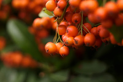
Second, the latter image has too much background "noise" (not the editing noise, I just mean visual noise) in the background of the photo which is because of my aperture being too high. Furthermore, the image has too many berries around the "main" area that I could've had. A much better idea would've been to get closer to the plant and take a shot of the dozen berries on the end of the plant, rather than getting and entire branch of them. This would have moved the focus closer to a single point and caught the attention of the viewer much more.
AO3: Record ideas, observations and insights relevant to intentions, reflecting critically on work and progress.
My plan regarding colour was to get images of plants which would relate to the artist research on Olena, where she gets bright photos of bright plants, much like my ones in the contact sheet. I got inspiration from the image bank while also gaining information from the artist research to find angles and light compositions for the photos taken. The use of berries gave me inspiration to find wild berries, which is why there is a plethora of berries in my contact sheet.
The majority of my photos came out as I wanted them to, although I was not able to get the greatest lighting in some images. This could be improved by going out a better time of day.
Regarding the best images (which I'll be analysing in order), I feel they correctly represented Olena's vibrant, yet muted, style. The first photo shows a few red berries under the shade of plants. I used an aperture of f1.8 for this image, and focused on the primary colour at the centre of the image. There is a moderate contrast with a necessary amount of exposure, just above the default amount. There is a big difference between the foreground and background when it comes to the sunlight and rays hitting the plants. There is a lot more sun hitting the back-side of the image, which adds a lot of depth to the image.
The second photo shows two similar plants taken at a very close shot (seriously, they were *tiny*) using my macro lens. I believe it fits this correctly because of how it has a moderate to low brightness while not having too much contrast. Furthermore, it uses a low aperture like most of the others which blurs out the background. The background, opposing the style of the past image, darkens the background and makes it look like the actual flora is catching the sun, which works from a proper standpoint.
For the third one, I believe it matches the theme well, and also links back to the first best image. There isn't much to say that I haven't already said, other than that I needed to raise the aperture ever so slightly, as it was way too shallow. For the last two images, they took a bit of effort to reach. Both of them are taken at macro level, as well as using defining complimentary colours to distinguish between the foreground and "background". The photos both use lighting in a way to produce depth between the two parts of the image, as both plants have darker parts below the subject, and one of the photos has a part which is lighter than the rest, due to its location.
AO2: Explore and select appropriate resources, media, materials, techniques and processes, reviewing and refining ideas as work develops.
For all the images taken, I used a Canon EOS 1100D with the default lens and macro lens, with a combined range between 15mm and 80mm. I took all images with normal exposure, a range of shutter speed between 100 and 1000, an ISO between 400 and 1600, and an aperture between f1.8 and f7.1. For the majority of the photos, aperture was kept at about f2-f5, while ISO was around 800 and shutter speed above 400. This was so I could get a good focus on the subject, which was commonly a small subject to get a photo of. I also wanted enough brightness to keep the image high quality, so the shutter speed was raised in turn with if i edited the ISO and aperture. However, I don't have any additional hardware to improve the photo. For an improved shot, a separate (not built in) flash and a small tripod would improve the stability and contrast in the shots, as I could get a bright foreground while lowering the power on the flash for a dark background.


improve the images I completed a variety of editing techniques. The first was a way of saturating the subject and desaturating the sides. For the majority of the photos, I edited brightness, contrast, exposure, all that good stuff. Then I decided to try experimenting with getting different amounts of select things in one area. For example, only making specific points saturated while the rest of the image is slightly washed out.


First, made a vibrance/saturation layer and use the lasso tool (any type of lasso tool will do it doesn't need to be accurate) and select everything that is not the primary subject you want. Then, press delete. After this, press vibrance/saturation in adjustments again and it will add a new layer which only includes the primary subject. Now you can edit each separate layer's vibrance settings to increase the subject and decrease the background.


Another thing I tried, similar to this, was using similar tools to edit how bright or exposed a subject is compared to the background. Much similar to the vibrance one, get a new one of the specific adjustment layers, select everything but the subject, delete, and make a second adjustment layer. Now you can edit to your heart's content. I used this because I needed images which were more exposed than they were before they were edited. It improved them and gave them extra depth.

AO1: Develop ideas through sustained and focused investigations informed by contextual and other sources, demonstrating analytical and critical understanding.
The artist research assisted me in this unit due to how it shown me that I could do plants from the macro level, yet with a new twist in-which lower brightness with a slight hue is implemented. It also related well to my strong point regarding close-up photography on the macro level, as most plants needed to be something like 15cm away from the camera for the shot. The research regarding the complimentary and analogous colours did help, although it did not improve the study by any significant amount. If I were to do this again, I would probably skip this if possible. On the other hand, the images taken by Olena did link back to these building blocks, which grab the viewers attention. Then, it could be theorised that they did assist me somewhat.
AO4: Present a personal and meaningful response that realises intentions and, where appropriate, makes connections between visual and other elements.

I believe that these images represent Olena and colour correctly, and show colour in its true form with complimentary colours used to contrast between the foreground and background.

The photos to the left were taken using a Nikon DSLR, shown because of how they were .dsc files. This gives a crisp image which can tell a story of such beautiful landscapes which this person has been to. They were taken in the afternoon to early evening, to give the photos an ambience of sun shining onto the leaves or plants. It has high contrast and vibrance, but possible a slightly lower saturation, while harbouring a warming filter to further improve the atmosphere shown. In the third image, there is a slogan which tells the viewer to "be faithful in small things", which connotes to how the photos all show macro images and focus on the smaller pieces of nature, rather than things like extreme landscapes or large trees. This type

of colour photography is about zooming in for a smaller, more detailed image of life.
These images inspired me to produce photos based on macro plants and flowers, showing saturated images with complimentary and analogue colour patterns.

AO1 Image Bank
The following images were added as part of my visual research


AO1 Contact Sheet
Selected Images
The following images were added as part of my visual research
AO1 Contact Sheet
Selected Images

These images were taken over a period of a week, using multiple areas where flora could be found. Some of the images had issues for example with F-Stop, and exposure, however these can be improved in future photos.
Best Images
I selected these as the best 5 images
Images which need Improvement
2 Worst images
The photos shown were selected due to them having a bit too much in the photo, and having a lot of things to focus on at once. I don't like this sort of thing as it can distract the viewers attention away from the primary subject, instead of focusing on the main subject. For example, the first photo shows a second, wilted thistle next to the main one. While this could be a very good contrast image, this is not what my focus is on in colour. The focus is on colour, not comparing two different things.
Second, the latter image has too much background "noise" (not the editing noise, I just mean visual noise) in the background of the photo which is because of my aperture being too high. Furthermore, the image has too many berries around the "main" area that I could've had. A much better idea would've been to get closer to the plant and take a shot of the dozen berries on the end of the plant, rather than getting and entire branch of them. This would have moved the focus closer to a single point and caught the attention of the viewer much more.
AO3: Record ideas, observations and insights relevant to intentions, reflecting critically on work and progress.
My plan regarding colour was to get images of plants which would relate to the artist research on Olena, where she gets bright photos of bright plants, much like my ones in the contact sheet. I got inspiration from the image bank while also gaining information from the artist research to find angles and light compositions for the photos taken. The use of berries gave me inspiration to find wild berries, which is why there is a plethora of berries in my contact sheet.
The majority of my photos came out as I wanted them to, although I was not able to get the greatest lighting in some images. This could be improved by going out a better time of day.
Regarding the best images (which I'll be analysing in order), I feel they correctly represented Olena's vibrant, yet muted, style. The first photo shows a few red berries under the shade of plants. I used an aperture of f1.8 for this image, and focused on the primary colour at the centre of the image. There is a moderate contrast with a necessary amount of exposure, just above the default amount. There is a big difference between the foreground and background when it comes to the sunlight and rays hitting the plants. There is a lot more sun hitting the back-side of the image, which adds a lot of depth to the image.
The second photo shows two similar plants taken at a very close shot (seriously, they were *tiny*) using my macro lens. I believe it fits this correctly because of how it has a moderate to low brightness while not having too much contrast. Furthermore, it uses a low aperture like most of the others which blurs out the background. The background, opposing the style of the past image, darkens the background and makes it look like the actual flora is catching the sun, which works from a proper standpoint.
For the third one, I believe it matches the theme well, and also links back to the first best image. There isn't much to say that I haven't already said, other than that I needed to raise the aperture ever so slightly, as it was way too shallow. For the last two images, they took a bit of effort to reach. Both of them are taken at macro level, as well as using defining complimentary colours to distinguish between the foreground and "background". The photos both use lighting in a way to produce depth between the two parts of the image, as both plants have darker parts below the subject, and one of the photos has a part which is lighter than the rest, due to its location.
AO2 - Edits/Experiments
Improving 5 best images
For all the images taken, I used a Canon EOS 1100D with the default lens and macro lens, with a combined range between 15mm and 80mm. I took all images with normal exposure, a range of shutter speed between 100 and 1000, an ISO between 400 and 1600, and an aperture between f1.8 and f7.1. For the majority of the photos, aperture was kept at about f2-f5, while ISO was around 800 and shutter speed above 400. This was so I could get a good focus on the subject, which was commonly a small subject to get a photo of. I also wanted enough brightness to keep the image high quality, so the shutter speed was raised in turn with if i edited the ISO and aperture. However, I don't have any additional hardware to improve the photo. For an improved shot, a separate (not built in) flash and a small tripod would improve the stability and contrast in the shots, as I could get a bright foreground while lowering the power on the flash for a dark background.

improve the images I completed a variety of editing techniques. The first was a way of saturating the subject and desaturating the sides. For the majority of the photos, I edited brightness, contrast, exposure, all that good stuff. Then I decided to try experimenting with getting different amounts of select things in one area. For example, only making specific points saturated while the rest of the image is slightly washed out.


First, made a vibrance/saturation layer and use the lasso tool (any type of lasso tool will do it doesn't need to be accurate) and select everything that is not the primary subject you want. Then, press delete. After this, press vibrance/saturation in adjustments again and it will add a new layer which only includes the primary subject. Now you can edit each separate layer's vibrance settings to increase the subject and decrease the background.


Another thing I tried, similar to this, was using similar tools to edit how bright or exposed a subject is compared to the background. Much similar to the vibrance one, get a new one of the specific adjustment layers, select everything but the subject, delete, and make a second adjustment layer. Now you can edit to your heart's content. I used this because I needed images which were more exposed than they were before they were edited. It improved them and gave them extra depth.

AO1: Develop ideas through sustained and focused investigations informed by contextual and other sources, demonstrating analytical and critical understanding.
The artist research assisted me in this unit due to how it shown me that I could do plants from the macro level, yet with a new twist in-which lower brightness with a slight hue is implemented. It also related well to my strong point regarding close-up photography on the macro level, as most plants needed to be something like 15cm away from the camera for the shot. The research regarding the complimentary and analogous colours did help, although it did not improve the study by any significant amount. If I were to do this again, I would probably skip this if possible. On the other hand, the images taken by Olena did link back to these building blocks, which grab the viewers attention. Then, it could be theorised that they did assist me somewhat.
AO4 - Final Piece
Finalising images
AO4: Present a personal and meaningful response that realises intentions and, where appropriate, makes connections between visual and other elements.

I believe that these images represent Olena and colour correctly, and show colour in its true form with complimentary colours used to contrast between the foreground and background.
Joe, the potential is there in the pictures that you have already taken to get a B however there is a need for you to finish the blog post with at least 4 final outcomes which have evidence of editing. The written elements on the blogger are good. Finally make your images EXTRA LARGE SO THAT WE CAN SEE THEM.
ReplyDelete