Line
Definition & Theory
Put short, lines are paths between two points. They can be a variety of shapes. For example; vertical, horizontal, diagonal, straight curved, or even jagged. They can imply a wide variety of things but primarily imply motion and direction/orientation. Be it physically or emotionally. Lines themselves can also be implied, and our brains perceive a line as being there, for we can perceive geometry in a variety of areas. Obviously, we can only do this if all or most points are in the frame.

IMAGE BANK & THEORY

Horizontal lines imply tranquillity, much like a sunset and horizon on a beach. A vertical line implies strength and perseverance, in addition to power. An example of this is a rock climber.
Diagonal lines imply action, and movement, much like a hill or running down one.
Curved lines, like a mountain road, imply sensual feelings, travel and calm.
Finally, lines that converge imply depth and distance. E.g. a crossroad converging in the centre of the photo shows the depth in the photo.
AO1 - Artist Research
Walker Evans
Walker Evans (1903-1975) was an American photographer who was primarily known for documenting photographically the story of the Great Depression in the 1930s. He also photographed a variety of things focused on line.

These images were photographed by Mr Evans throughout his time as a professional photographer, using black and white film. The images were created to show a large landscape with a specific leading line to follow to grab the viewers attention. The first image is a very bleak setting most likely from North/West Texas in the 30s. It shows how much of a quiet and eerie area it must've been before the events that led to people moving in, which is catalysed by the fact that the gold rush had ended and all the people had moved out for greener pastures.
The second image shows a single country road with two hitch-hikers. This represents how two-faced America was and arguably still is. People keep being fed propaganda about how they should be patriotic about America and to "Live the American dream", yet people are abandoned and left to fend for themselves without money and sometimes food.
The final image shows what seems to be a rainy or even slightly flooded street where hundreds of Model T Fords are parked up, which shows how corporate life has been, even since the roaring 20s.
AO1 - Contact Sheet
Contact sheet(s) on Line
5 Best Images
2 Images that need improvement
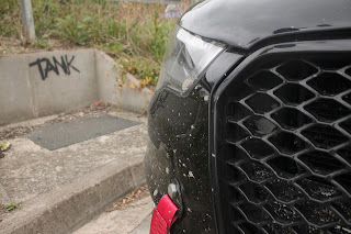
These images have significant issues. While the former looks tolerable, the F-stop was too high which meant the background was in focus, as-well-as using the incorrect lens at some points. My idea for line was to find urban objects around the town centre, much like Evans' urban line images of days gone. Especially with leading lines, like from the crossing or the bench in the 5 best images.
To replicate images like these, I would have to follow the strategy of altering exposure depending on what area, latitude and time I am in. Furthermore, the F-Stop must be perfect for if I want to complete an image which is in macro or a zoom image.
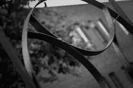
The first image of the top 5 is of bent metal in a garden on campus. It shows very clear curved lines to convey sensual feelings and emotions around being calm. However, if your eyes stray to the severe left or right of the page it shows there are also straight, diagonal, leading lines which move in parallel up the photo. They signify movement, but in a more symbolic term rather than physical.
The next one is probably my favourite one. This is a photo of a hexagonal bench which was taken at macro level. The lines all move parallel at a diagonal, then straight angle, signifying movement and power. The leading lines are also at a specific angle to show depth within the photo.
This third one is a photo of a brick indent in a wall. The photo shows two to three leading vertical lines which all, funnily enough, converge on a CCTV camera. This signifies symbolic power and strength.
The penultimate photo is one taken from a maintenance cupboard door. It shows multiple horizontal lines signifying how it's possible to find calm in any situation, no matter where it is. The lines also converge onto brick which then has four more horizontal lines.
Finally, this crossing was taken just outside A building on campus. There are two leading lines which converge through linear perspective at the middle of the frame, and other road lines branching off of the subject. While I like this one, I feel it could do with some more work because it seems to me like there is surplus information in the picture. This could be remedied by, like I said, editing the F-Stop and also editing the photo post production.
In the production, I used a Canon EOS 1100D (c. 2011) for all shots, with the 1100D spec lens and a macro lens, with 50mm range. The images in this contact sheet were taken with F 5-8 (minimum is like 1.2), and usually, they were taken between 30-50mm. The ISO speed was set between 800 to 1600, and the exposure was kept level, at 0. Shutter speed was commonly set at higher speeds to reduce brightness quickly, so it was set between 100 and 4000. During the shoot I increased the shutter speed to get the shot to take a more still photo, as-well-as wanting a darker hue. F-Stop was commonly left at around 5-7.1, but I used around the 8 area for longer shots.
AO2 - Edits
To improve these images, I used an editing tool to make them relate to the artist alot more than they did beforehand. Because of this being done on a home computer, I used Paint.Net in replacement to Photoshop as it is as reliable, but much more cheap.The images all took a similar path. First, I used the brightness and contrast to raise the contrast in the images, which can commonly be related to images taken on old cameras.
Next, I edited the saturation, lightness and curves, as-well-as changing it to black and white at the beginning. These are all found above.
After that step, I went onto "Effects" and added a vignette to give a more defined focal point on the images. Vignette can be found under "Photo" in the effects tab, and repeated using hotkeys Ctrl+F.
The artist research definitely assisted me as it gave me a better insight into what I should be creating, regarding perspectives on roads and urban photography. As I was researching Evans, this was perfect since I live in an urban area which gave me the opportunity to base off of his urban pieces, making some serious shots. I am quite happy with the research on the emotions linked with line, as it gave me great information so I could manipulate my photos in a way which instils specific emotions in others. Typically, leading lines were great for this as it shown power and strength, but could also be perceived as metaphorical and political power.
AO4 - Final Piece
In my opinion, I think I have created an image which could be linked to Walker Evans in a direct way due to the post-production editing. However, to improve, it should've focused on a road rather than this object. This means one of the edits deserved a spot on the Final Piece, rather than still being an edit.
Thankfully for the final piece, I decided to try out the noise. And I believe it worked out positively for the image, giving it a vintage style. (4 of them decided to be pixel-y)


overall good progress, you will need however need to follow the set structure for blogger and include the AO's as part of the work you submit. Finally for AO4 you will need to ensure that you post AT LEAST 4 FINAL EDITED IMAGES.
ReplyDelete