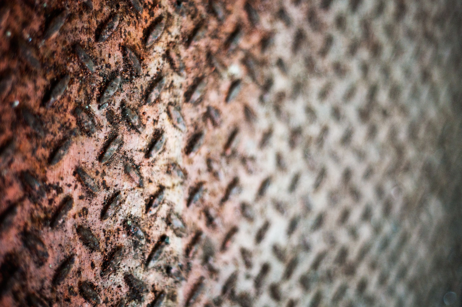
Texture
Texture:-
Refers to the tactile qualities of the physical surface of an object. E.g. How does a surface feel when touched
Texture can be perceived by using light. For example, using a single spotlight on one side of the subject you can emphasise specific parts of the photo by giving them a larger shadow, which creates a feeling of depth within the photo. This could be from taking pictures from sunset/sunrise, and for a photo with a smoother texture, you would take it at midday, or in a room with light around the entire area.


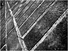
Pattern
Pattern:-
A pattern is a perceived structural or repetitive surface which continues in a consistent way. It can be described as shape and form constantly repeating, but can also be seen as a skeleton which organises parts of a composition into a regular or irregular shape.
In summary, they are just shapes repeated. More long-winded, they are repeated colours, shapes or objects in a regular or irregular formation. Using this in photography is great to get a good composition and can completely change images from being boring to beautiful.


AO1 Texture Artist Research - Aaron Siskind
Aaron Siskind (1903-1991) was a professional photographer who focused on architecture and nature, as well as utilising texture and occasionally pattern. He began from being gifted a new camera at a wedding, and started honing his skill by taking photos on his honeymoon. Eventually, he decided to become a professional and took photos for a living.


These images were photographed much like how Walker Evans did. They used black and white cameras which gave the effect of an unnatural and uneasy theme. They also use a high amount of contrast which makes the different parts stand out. They could also link back to line and imply motion to another point. The texture of the photos is a very rough and negative feeling, connoting to how man-made objects are all made roughly and don't go through natural ways of being built. The photos use a black and white filter too, to make the photos look more grunge-y and interesting.
AO1 - Image Bank
The following images were used for my research and inspiration.


The above images show things I have the ability to get photos of in my immediate vicinity. They have both pattern and texture in most images, and can work if shot in B/W.
AO3 - Contact Sheet
My selected images


Texture 5 best Images


Pattern 5 best Images


Texture & Pattern 4 worst Images


The worst images were obviously selected due to the exposure issues, for the most part. The middle two are way too overexposed, and the rest just didn't have a good angle or hue. The first one was a good angle for the shot, however it just doesn't have good lighting. To improve the shoot, I would use a tool similar to one of those bubble measuring things which shows horizontal and vertical axis'. Furthermore, I am going to make sure to control the exposure levels shown on the images.
AO2: Explore and select appropriate resources, media, materials, techniques and processes, reviewing and refining ideas as work develops.
The photos shown were taken using a Canon 1100D with a macro lens. They were taken in a range from f2 to f11,with a slight underexposure.


For each image, I decided to give a high contrast to make sure the textures were much more defined in the photos, as this gave a very grungy feel, as well as helping focus on the current formal element. For some photos, I tried out a new technique (burning & dodging) to increase highlights or dark areas & midtones. This gave the photos much more depth and added a lot more perceived parts of the image. This gives more abstraction, which means without the context of the original place where it was taken, the images can stand for more than it actually is. For example, the two brick-pattern photos do not give context as to where they were taken. They could be on the ground, it could be a roof, a wall (they were both walls), anything where bricks can be used. However, the darker brick image does look much like a wall because of how the photograph was taken slightly angled upwards, which makes the brain perceive it as being a wall rather than a floor. Especially as the light is coming from the top edge of the photo. To improve how abstract the photos are, I could improve the camera angle by using a tripod in my future shoots and making sure each photo has correct placement of lighting to give the intended final piece.
AO4 Final Piece
AO4: Present a personal and meaningful response that realises intentions and, where appropriate, makes connections between visual and other elements.


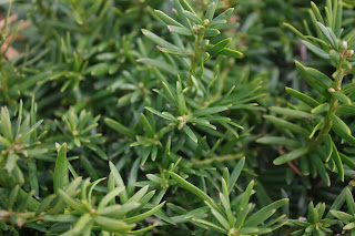
All these images follow the subject of high contrast, black and white and a dark theme. It gives the grungy look I was looking for, as if this was all taken on a grey day in some abandoned city. It almost feels like it tells a story of showing different areas of a city which has been abandoned by all of its civilians, frozen in time. And then you find a single plant, as if to show that life still finds away even in an urban jungle.
please update this post by adding the contact sheet and showing the image edits. There is a need for you to try to maintain the posts including the written evaluations. Having said that you have demonstrated good compositional and framing skills. after they are edited I am sure that the set grade will improve.
ReplyDelete