Tone
Definition & Theory
This refers to the lightness or darkness of something. This could be a shade or how dark or light a colour appears.
Tones are created by the way light falls on a 3D object. The parts of the object on which the light is strongest are called highlights and the darker areas are called shadows. There will a range of tones in between the highlights and shadows.
Without tone Form does not exist, tone is therefore an important aspect in the visualisation of 3D objects.


 The diagram shown describes how Ansel Adams' zone system works. From 0 to 10 - it shows different types of detail in an image. With shadows, mid-tones and highlights. Commonly, photos have two different ways of capturing light. Diffuse lighting, and direct harsh lighting. Diffuse lighting is where there are multiple light sources, or light covers most of the photo, while harsh lighting is where it focuses on a concentrated point.
The first of the two is a very harsh light. It concentrates the light on a single point in the face, giving a threatening feeling to it, almost imposing feeling. It gives a sinister vibe and could connote strength and masculinity, as it is shown with defined features on the face.
However, the second uses a smoother, more diffuse lighting scheme. Marilyn Monroe's portrait uses a more equal lighting area, with the majority of the photo above 5 in the zone system, except for the dress. She has a more composed face and body, with features not being as prominent giving a smoother look to the general body.
Ansel Adams
Landscape & Tone
The zone system is a guide created by Ansel Adams which gives information on what areas of the photo are. You have Zone 0-3, which are all shadows. There are mid-tones from Zone 4-6, and then 7-10 describes the highlights of the photos.


AO1 - Callum Mclerney-Riley


Contact sheet
All photos

Best Photos


Worst Photos


For these photos, there wasn't exactly a large amount of editing to do. Because I was mainly focusing on tone I knew it would only really take the normal editing that I would do for most photos. The most important part of the photo in my opinion is levels, however you customise them. For convenience I used brightness/contrast tool on this time (took the screenshots a day after I finished editing), but usually it is good to experiment with how the tones compliment each-other in the photo to eventually get the desired effect. If you were to also use brightness/contrast, it is a lot simpler but will take a little bit of gradual change to get the edit you want. Obviously it would probably be a healthy idea to click on the B/W tool to make sure we know what we're working with. It's good to do editing in colour, but if you intend the final piece to be black and white, you should probably remove the colour as soon as you can. The B/W tool also gives you customisation of how bright the colours are when they get put in B/W. This gives you breathing room to make the photo more quality. For example, if the sky is a cyan/blue colour (which it usually is), depending on other settings it might end up quite dark after you remove colour. You can rectify this though by simply increasing the cyans and blues to a brighter hue, which will keep the area of colour while increasing how bright it is.
Finally, we should probably touch on exposure to refine the tone of the photo. Preferably it's best to utilise all three settings found in exposure, but using offset and gamma are not mandatory. From what I find, exposure (as it should) increases or decreases the amount of exposure an image has, and exposure itself is about how all three settings (ISO, shutter speed, aperture) are laid out. Depending on the settings you can get more or less exposure. Of course, now with all of the fancy technology all we have to do is edit the exposure in post, as we're doing now. Obviously for tone, a slightly increased exposure would help. How I do it is I gradually increase the exposure until I find when it is slightly too much, then decrease it until I find an in-between of not enough and too much. Then on to offset. From experience I find this helps slightly decrease the amount of contrast it uses. This helps when it looks slightly overexposed but is underexposed in any other setting. Finally, gamma correction does exactly what it says on the tin. Edit this one until the gamma matches the intended effect and there you have it.
Camera Settings
The photos I took were all from my Canon EOS 1100D I used in all my other shoots. I used a range of ISOs from the very highest values to the lowest possible values, due to the complexity of shooting one day and one night (I'm guessing from 3200/6400 to ISO 200, or even 100.), as well as using a varying shutter speed. This was similar to ISO, as it needed a slower speed to deal with darker areas. For aperture however, I did not use manual in the night shoot. I could tell I wasn't going to be able to find an efficient balance between the three settings, so I used a shutter speed-priority setting and only changed shutter speed depending on my needs. Even then because of how dark it was, I was only able to get slower shots so the tripod I had borrowed from the college became quite useful. In the daylight, I'm guessing my aperture was a mix of F4 to F8.
Final Piece
Five best photos edited


These are the photos I have decided would be in my final piece. They signify the hostility of the night, while also having the comforts of the day. It captures a lot about what Harlow is to people, and how it might look to the individual who is metaphorically outside, looking in to see what its like. In my opinion, I believe the photo-shoot was partially successful. While many photos turned out amazing, others didn't turn out as well as I would have liked them. This is because of the times I had decided to go out. Most obvious, I went out when it was raining. This impacted the quality of the lens due to the droplets hitting it. This can be seen in the diversion shot as one of the streetlights has a droplet superimposing it on the lens. Although, for the other points I was taking photos the rain did come to my advantage. In addition, I also had the issue of my camera not being able to successfully handle darker scenes which meant I had to make do with slower shutter speeds and other settings which might compromise the quality of the photos. Either way, they all came out almost as I had hoped, which I consider to be some sort of success.
Ansel Adams
Landscape & Tone
The zone system is a guide created by Ansel Adams which gives information on what areas of the photo are. You have Zone 0-3, which are all shadows. There are mid-tones from Zone 4-6, and then 7-10 describes the highlights of the photos.


AO1 - Callum Mclerney-Riley

AO1 - Ansel Adams
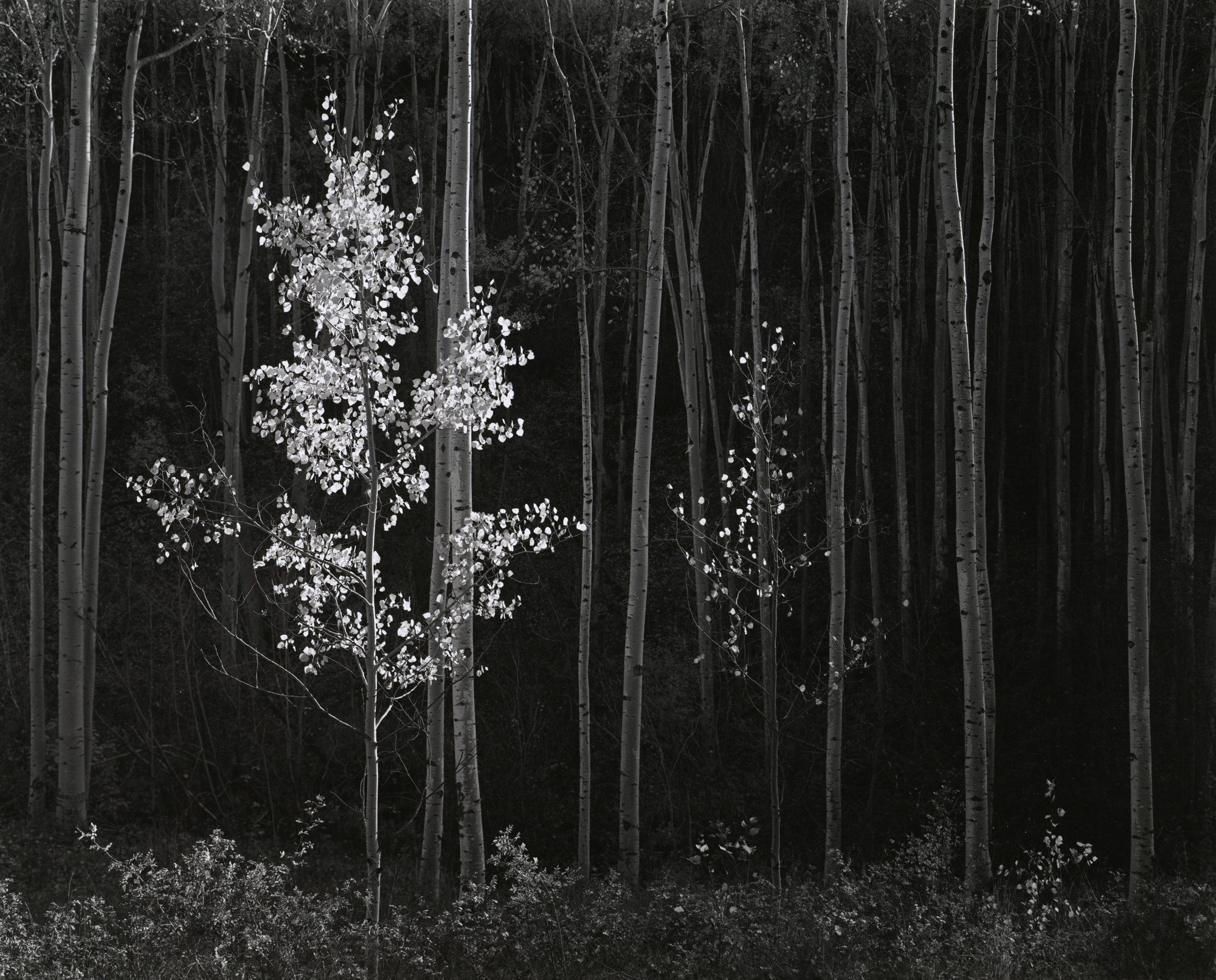
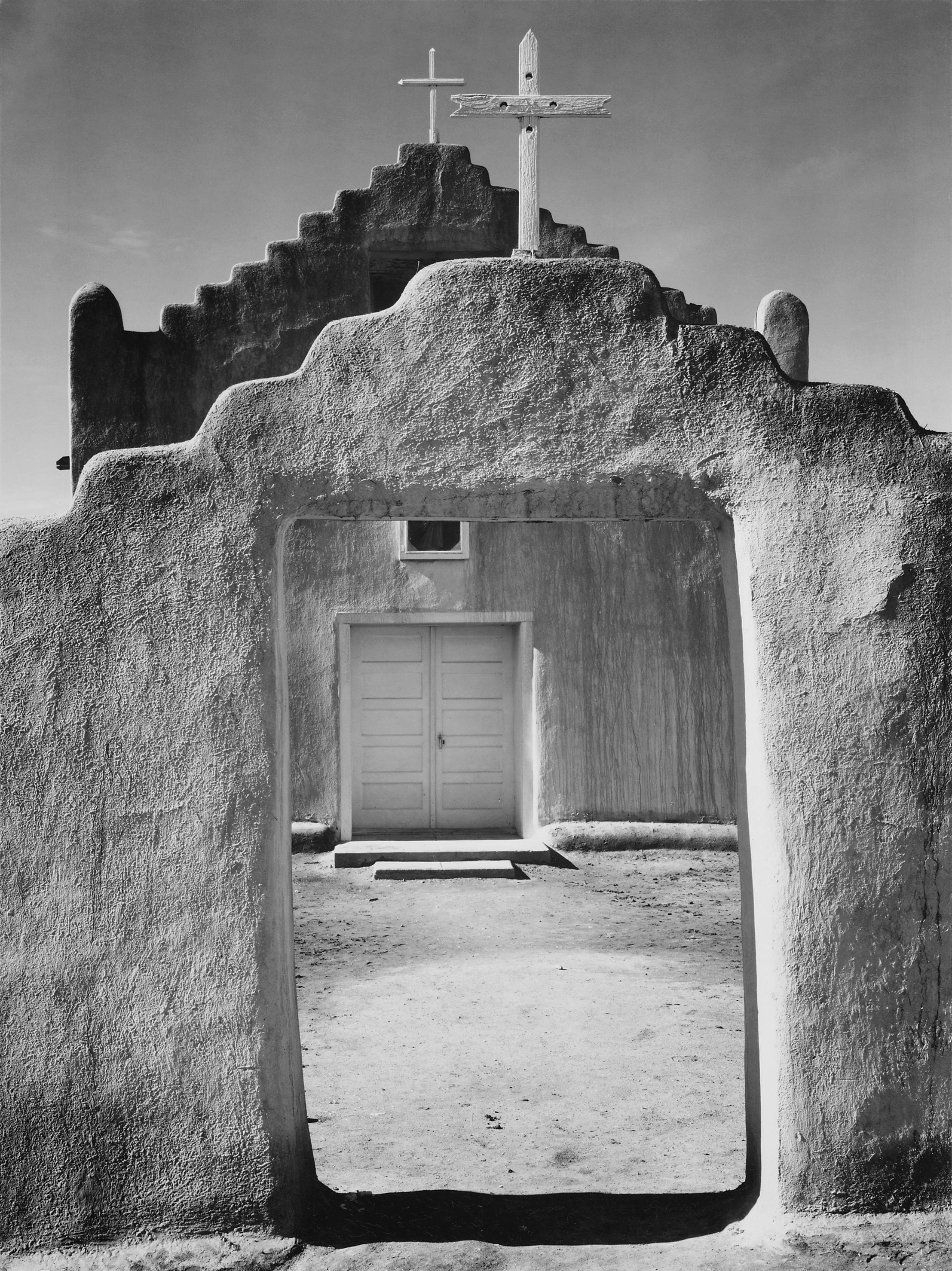
As previously spoken about, Ansel Adams was a professional photographer born in Monterey California on April 22 1984, and is famous for his many photos from Yosemite and other places in the southern region of the USA, like El Paso (which is where the church photo may have been taken). The photos he is famed for are based around using high aperture to capture vast landscapes and areas of interest in photography. Because of this, he assisted in founding a group called f/64, which derives it's name from the symbol for the highest aperture on expensive cameras/lenses, which is an F-Stop of 64. I digress; his photos that he takes definitely use a high aperture with varying settings elsewhere. For the first photo I found, it's of a forest he visited at night. It seems he took the photo keeping composition in mind, as he managed to get 2 different trees in the shot which both diverge between the middle third and right & left third respectively, which makes it almost symmetrical. This is good for the photo as symmetry is commonly a way of making the photo more interesting and nice to look at. The photographer also took into consideration the contrast between where the flash took place and where the pitch black was found, and other than the two familiar trees the photo itself looked quite alien. Because of how the trees shown all have no defining features other than the trunks themselves, they look very odd, almost creepy. When I first saw the actual photo it really piqued my interest because of it's ambiguity, which is why I actually picked it.
The second photo is probably one of Adams' most famous photos from Yosemite. The photo is of a lone tree above a few boulders, and it seems to have literally grown around them. I quite like this photo actually, as Adams uses the environment to his advantage and gets a tree which takes up the top half, boulders which take the bottom half and they both end up framing the centre where there are a lot of mountains in the far background. It makes a perfect shot, capturing the vastness and uniqueness of America, specifically the midwest and southern parts. How wild and interesting it is.
All photos

Best Photos
Worst Photos
So the assortment of photos shown definitely vary in quality. For example, we have some strong ones like of the cross and of the dimly lit pathway, yet we have others like the diversion sign and bicycle sign which could've been captured better, but the circumstances led to it turning out in such a way. Starting from the top, we have a photo of a cross which commemorates those lost in both World Wars, and it can be found in a memorial in Harlow Town Park. The Town Park has commonly been a favourite of mine to capture nature and architectural pieces, much like the centrepiece in the middle of the lake you can find just before walking to the memorial. As well as this, it also has probably the largest amount of natural land which is consistently maintained that you can find in Harlow. Back on track, the cross seemed to be a very strong piece when I saw it due to the angle I was facing it from, and the way the different tones complimented one-another. For example, how the stone under the shadows in-between the cross pieces contrasts directly with the rest of the stone, while both of them still give off sufficient texture to give the viewer an estimation of what it might be. Furthermore, there was a natural barrier made of trees which covered the lower/middle left/right thirds of the photo. The border really does help give context of where it might've been taken, as it shows that the cross is found in some natural area, rather than a completely empty place - which may be what people think thanks to the overcast sky at the time.
For the next ones, we see a large graphic sign displaying the name of the town, and a bicycle sign. Both of these have very good ideas originally. The first signifies the area it was taken, but also the identity the photographer might have. Usually people have direct connections with their home town, so seeing the name of the town might link to feelings of home, and relief. Moreover, they use the comic-sans font which could link both the town and font to childhood, as the font is commonly used in teaching young pupils as of how comparatively easy it is to read. The bicycle sign however could have completely different connotations. While it is quite a simple photo and sign, it could connote to how people are told what to do by signs and other people of authority every day. From the simplest thing like telling someone to "cycle this way" and not the other way, could have vague links to authoritative systems where people are told what to do no matter when it could be more liberal. Obviously though, the sign isn't really a great photo for that subject. For it to be considered political would be a stretch from the usual.
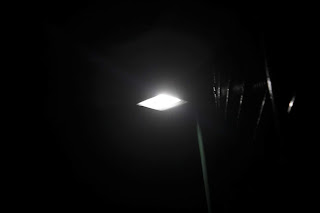
The final two I find quite nice. The first one is a small pathway just past the underpass I took a photograph of. It was taken at clearly a very dark time, as was most of the photos since they were taken in two shoots. The second is of a roadwork utility tool to notify drivers on the road of the impending roadworks which would be taking place on the road. This really sits well with me due to how interesting the yellow lights are to look at in the contrast of a place which looks like it's in a complete blackout. This is clearly not a direct link to town however, but in my opinion it captures it in its own way. It's similar to those neon photos people take. They don't directly catch tone but they catch how light can change in different situations. Returning to the pathway shot, we see an extremely dark path which had been drizzled with rain over the past hour. As the lights turned on as the night was still young, the cold-white streetlights turned on to give the floor a very damp look. This shot was absolutely perfect, and so worth it. When I was originally taking the photo, I remember rushing the photo because of where I was positioned. In reality, I was stuck with my back facing the underpass which meant that I was basically done-for if anyone decided they wanted to take advantage of my situation. Ironically, the reason I went out became the liability. After I took the photo though, I continued on to take the later photos without much hitch, other than the occasional jumping at shadows.
Edits
How I improved them


For these photos, there wasn't exactly a large amount of editing to do. Because I was mainly focusing on tone I knew it would only really take the normal editing that I would do for most photos. The most important part of the photo in my opinion is levels, however you customise them. For convenience I used brightness/contrast tool on this time (took the screenshots a day after I finished editing), but usually it is good to experiment with how the tones compliment each-other in the photo to eventually get the desired effect. If you were to also use brightness/contrast, it is a lot simpler but will take a little bit of gradual change to get the edit you want. Obviously it would probably be a healthy idea to click on the B/W tool to make sure we know what we're working with. It's good to do editing in colour, but if you intend the final piece to be black and white, you should probably remove the colour as soon as you can. The B/W tool also gives you customisation of how bright the colours are when they get put in B/W. This gives you breathing room to make the photo more quality. For example, if the sky is a cyan/blue colour (which it usually is), depending on other settings it might end up quite dark after you remove colour. You can rectify this though by simply increasing the cyans and blues to a brighter hue, which will keep the area of colour while increasing how bright it is.
Finally, we should probably touch on exposure to refine the tone of the photo. Preferably it's best to utilise all three settings found in exposure, but using offset and gamma are not mandatory. From what I find, exposure (as it should) increases or decreases the amount of exposure an image has, and exposure itself is about how all three settings (ISO, shutter speed, aperture) are laid out. Depending on the settings you can get more or less exposure. Of course, now with all of the fancy technology all we have to do is edit the exposure in post, as we're doing now. Obviously for tone, a slightly increased exposure would help. How I do it is I gradually increase the exposure until I find when it is slightly too much, then decrease it until I find an in-between of not enough and too much. Then on to offset. From experience I find this helps slightly decrease the amount of contrast it uses. This helps when it looks slightly overexposed but is underexposed in any other setting. Finally, gamma correction does exactly what it says on the tin. Edit this one until the gamma matches the intended effect and there you have it.
Camera Settings
The photos I took were all from my Canon EOS 1100D I used in all my other shoots. I used a range of ISOs from the very highest values to the lowest possible values, due to the complexity of shooting one day and one night (I'm guessing from 3200/6400 to ISO 200, or even 100.), as well as using a varying shutter speed. This was similar to ISO, as it needed a slower speed to deal with darker areas. For aperture however, I did not use manual in the night shoot. I could tell I wasn't going to be able to find an efficient balance between the three settings, so I used a shutter speed-priority setting and only changed shutter speed depending on my needs. Even then because of how dark it was, I was only able to get slower shots so the tripod I had borrowed from the college became quite useful. In the daylight, I'm guessing my aperture was a mix of F4 to F8.
Final Piece
Five best photos edited


These are the photos I have decided would be in my final piece. They signify the hostility of the night, while also having the comforts of the day. It captures a lot about what Harlow is to people, and how it might look to the individual who is metaphorically outside, looking in to see what its like. In my opinion, I believe the photo-shoot was partially successful. While many photos turned out amazing, others didn't turn out as well as I would have liked them. This is because of the times I had decided to go out. Most obvious, I went out when it was raining. This impacted the quality of the lens due to the droplets hitting it. This can be seen in the diversion shot as one of the streetlights has a droplet superimposing it on the lens. Although, for the other points I was taking photos the rain did come to my advantage. In addition, I also had the issue of my camera not being able to successfully handle darker scenes which meant I had to make do with slower shutter speeds and other settings which might compromise the quality of the photos. Either way, they all came out almost as I had hoped, which I consider to be some sort of success.
No comments:
Post a Comment